Ramp
Time is money. Save both with spend management.
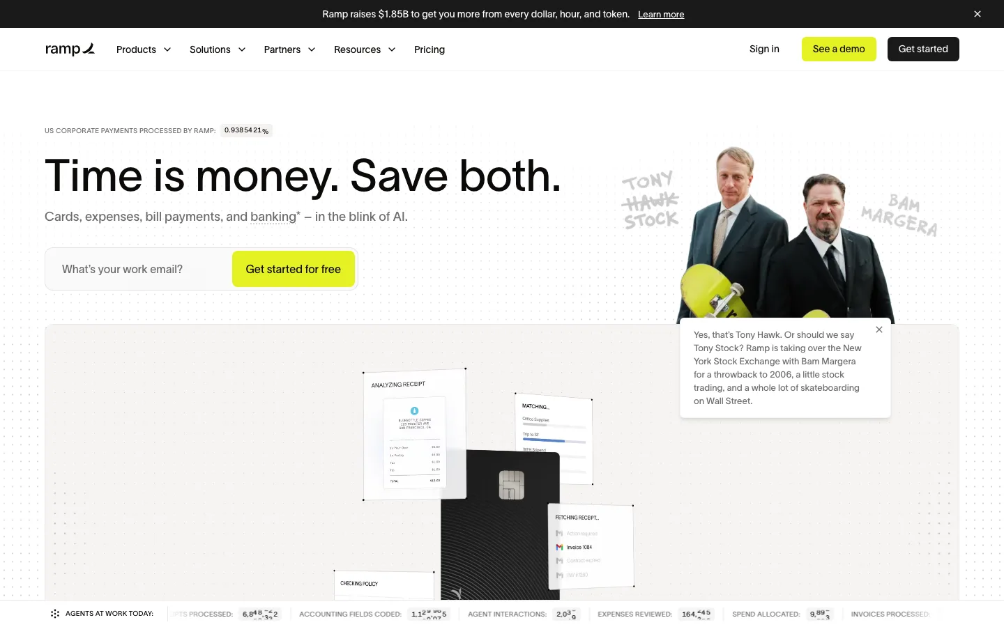
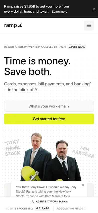
A fintech marketing landing page featuring bold typography, high-contrast neon yellow accents, and an interactive product preview grid.
Notes 3 of 7
- typography
The headings use a heavy grotesque sans-serif typeface, TWK Lausanne, creating strong hierarchical contrast against smaller neutral body copy.
- color
A vibrant acid-yellow accent color is used sparingly on primary action buttons, instantly drawing the user's eye to conversion zones.
- layout
The hero section pairs an off-center conversational imagery block with a minimal email capture input, balancing white space efficiently.

Tagged clean · bold · corporate · high-contrastPublished